
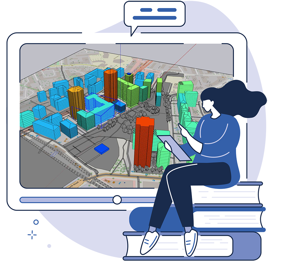
Access technical training any time, anywhere
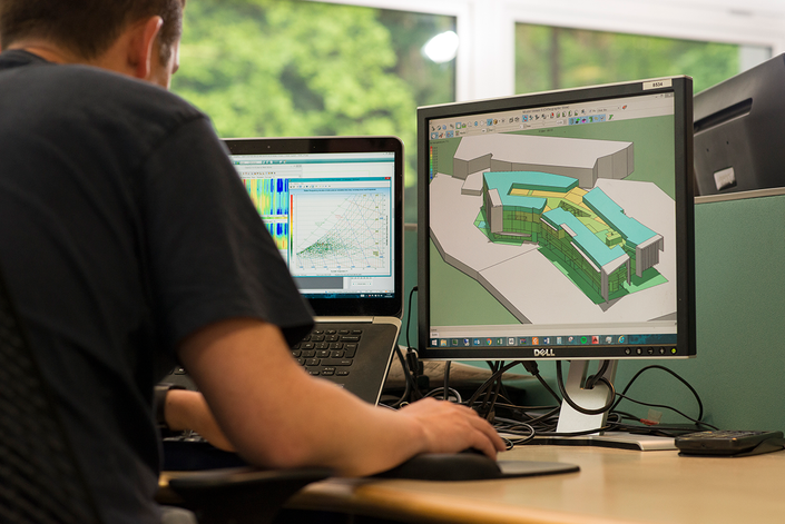
IES’s On-Demand Learning courses provide access to technical training whenever you want to learn. Delve into over one hundred hours of free and low-cost on-demand learning videos. Courses cover key IES software tools so you can be sure to take advantage of the full breadth of our digital twin technology.
Over 100 hours of on-demand training content broken into courses covering all aspects of IES technology.

On-demand courses developed by IES’ most experienced training instructors.
Additional training notes, models and quiz sections to support learning.
Used by built environment professionals across the world

IES On-Demand Courses


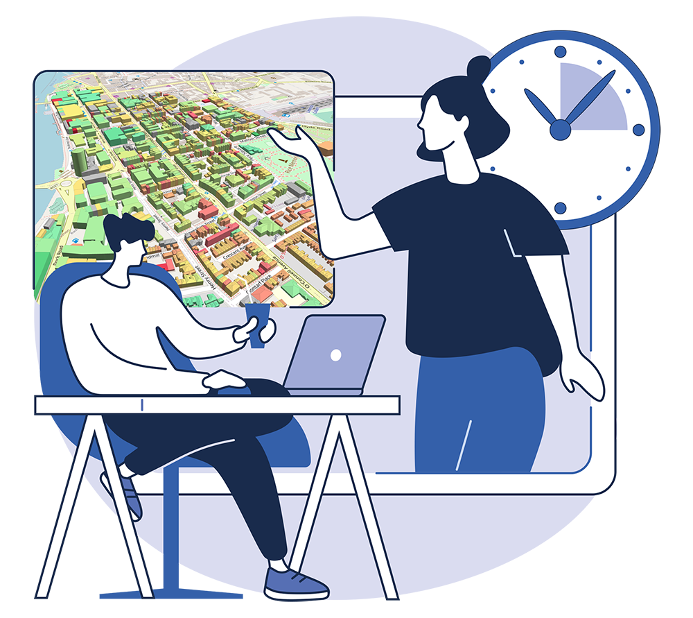
IES Coaching
Our Coaching service offers a personalised online session with an experienced IES trainer for individuals or groups within an organisation. Sessions are fully interactive, giving participants the opportunity to screen share with the trainer and ask questions that have arisen from projects, studies or previous training sessions. Sessions are available to book in 30 minute, 60 minute and 90 minute slots.
Any Questions?
If you would like further information about IES On-Demand Learning, please contact our Training team.